..I make up for with Persistence.
Or maybe not "make up for," but I do keep trying.
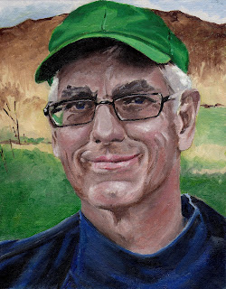
I haven't posted in a week because I was diligently working on a portrait of Handsome in oil paint, and I didn't want to do the Saran Wrap On The Scanner method of documentation, because that came out pretty weird.
So I waited until the portrait was dry enough to scan. (Turned out not to be quite dry enough, because now there are oil blobs on the scanner. Oops.)

Or maybe not "make up for," but I do keep trying.
I haven't posted in a week because I was diligently working on a portrait of Handsome in oil paint, and I didn't want to do the Saran Wrap On The Scanner method of documentation, because that came out pretty weird.
So I waited until the portrait was dry enough to scan. (Turned out not to be quite dry enough, because now there are oil blobs on the scanner. Oops.)

It's not terribly, terribly, depressingly bad, but the man is actually much better looking, and his chin, while chiseled and dimpled,
is not so overwhelmingly large.
Then, since I generally get more enjoyment out of watercolor portrait sketching, I set out to improve upon my attempt,
this time, in watercolor.

Aaack!
I think it might be wise to stick with
portraits of people I do not know.
These are great efforts Suzy. All painting is successful if you have learned something in the process. I agree your oil painting is the better portrait. A few areas I see that could use some tweaking:
ReplyDelete1. The hair color might be too pure of white. In the photo I see more cool light blues and greys.
2. The color of the skin behind the glass lenses seems to be a little darker in the photo than in you painting.
3. What's with the green hat?!?!?! I thought the red hat like in the photo was a good counter-balance to the green background.
It's great to see how other artist see things and render it on canvas. There are so many details that most people take for granted in a casual glance that an artist will see in wonder.
Ah, the green hat! I got it into my head that I should be working with a more limited palette (and the husband's a John Deere kind of guy,) but the red would make for a better painting. I may revisit this one and slap a red hat onto it--and rework the eye area. (and the face and the background and....)
ReplyDeleteThank you, indeed, for your guidance!
I heard (or read) somewhere that "green" is one of the more avoided colors in paintings. I don't know why ... but if you look at all the pre-impressionist painters, I don't think you'll find many of their paintings that have strong elements of green in them.
ReplyDeleteIt's not a rule, just an observation.